As we continue to build the theme for our blog, we have been spending an excessive amount of time trying to get the font sizing correct for the myriad of devices that exist today.
We’re very interested in Tim Brown’s Modular Scale and thus we’ve decided to use the clamp function in CSS.
A sizing scale is a uniform progression of sizes based on a scale—or, more accurately, a ratio.
Our initial attempt at font scaling was during engineering. While the designs we’ve created exist in Figma, we were finding it difficult to get the linear font scaling correct while looking at artboards. Instead, we wanted to see how the fonts would look in real-time, with actual content on a website, where we could adjust the browser window and test the scaling dynamically.
We have found that this is not the ideal process for our team. We’ve wasted hours with our engineers and designers trying to use inspector to find the correct font sizing and spacing for various viewports. So, we needed a new method.
Figma Prototypes for font scaling
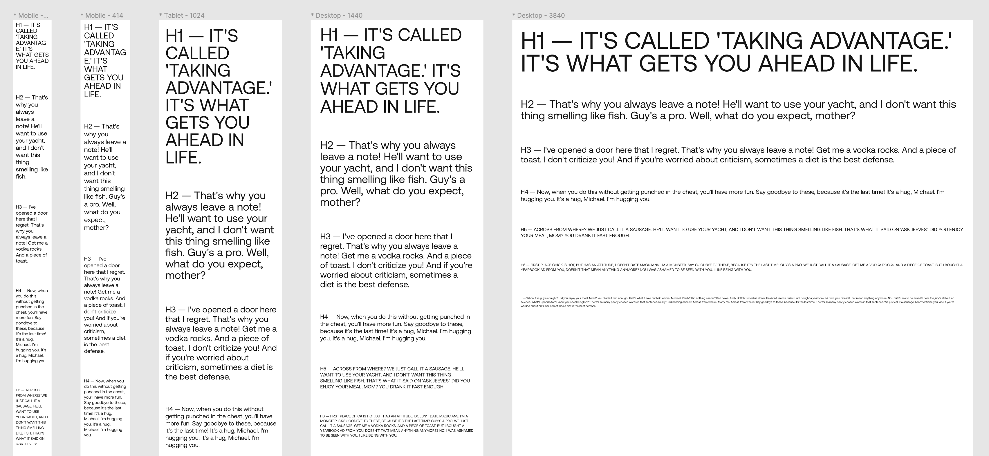
Enter Figma Prototypes. We’ve been using prototypes for a while, but never as a pure method of testing font scaling. In our case, we created a few artboards at various common sizes, making sure we accounted for both the smallest size we’ll account for and the largest, and added text. Then, by opening a prototype with the following settings, we are able to view text almost identically to how it will appear on the web (we tested):
- Device = none
- Fill = 100% – display at full size
- UI = hide Figma UI

Above you can see a solid representation of how the fonts will look at various sizes. Using this as a guide, we can then do proper font scaling using the clamp method.
We also suggest Type Scale as another great tool for finding the right font ratio.


