UI Styles
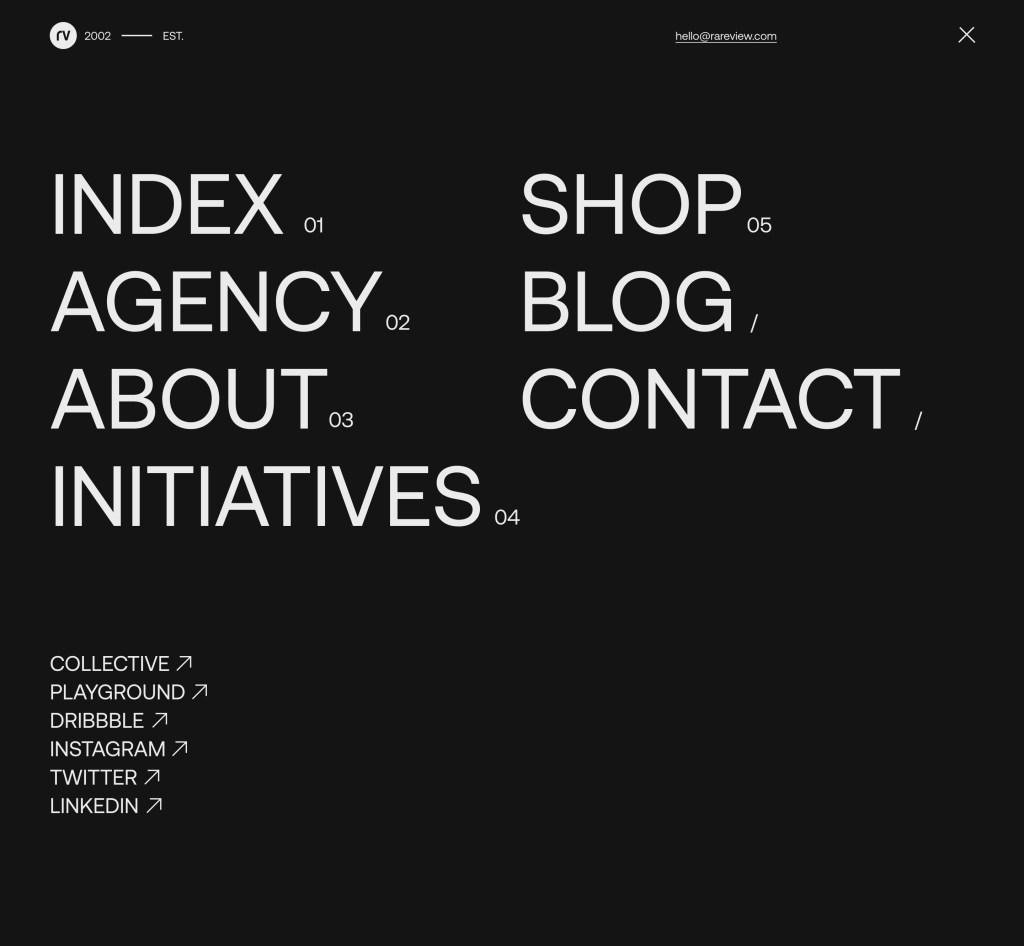
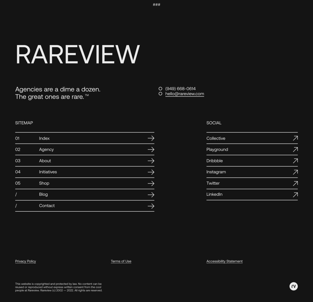
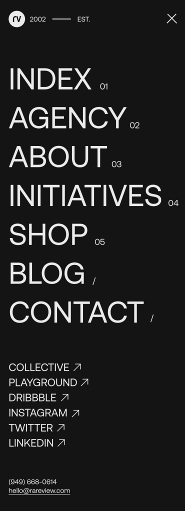
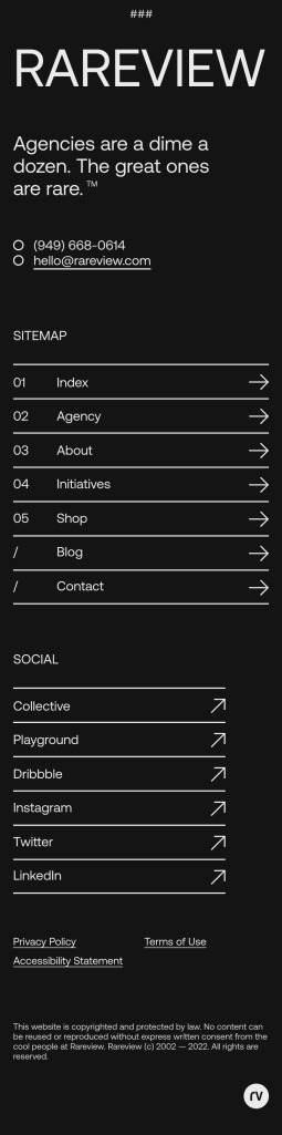
We have finally settled on a UI style for the website. It’s going to be a simplistic, almost European-style design.
The numbered pages in the menu correlate to Our Story, which we will launch next year when the site launches. The idea is that a user can read our story like the chapters in a book, from start to finish. We’ll tease some of the content on the website, but the full story text will be available on the blog.
Here’s a few of the elements that we have produced.
Considerations
We have several ornamental icons we’re using throughout the site, including some arrows. For usability, the right arrow will indicate a link or path to a page that is on the website, whereas the angled arrow will indicate that the user will be taken off the website.
Engineering
We have started to build the foundation of the new theme on our blog. It’s still early, but @Damon is leading that effort on our end. The site is based entirely off a grid system and one of the first things that Damon created as a debug toggle that allows us to toggle on/off the grid. It’s super helpful during these early stages of designing in-browser.