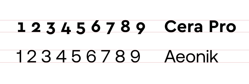
We have been using the same font for a few years and we have all determined it’s time for a refresh. Our current font is Cera Pro. While we do love it, the numbers of the font have always created issues for our design work and legibility. Take a look at this comparison between Cera and Aeonik (the new font we’ve chosen). Notice how the numbers do not sit on the same plane, which has always bothered our design team.
Font exploration
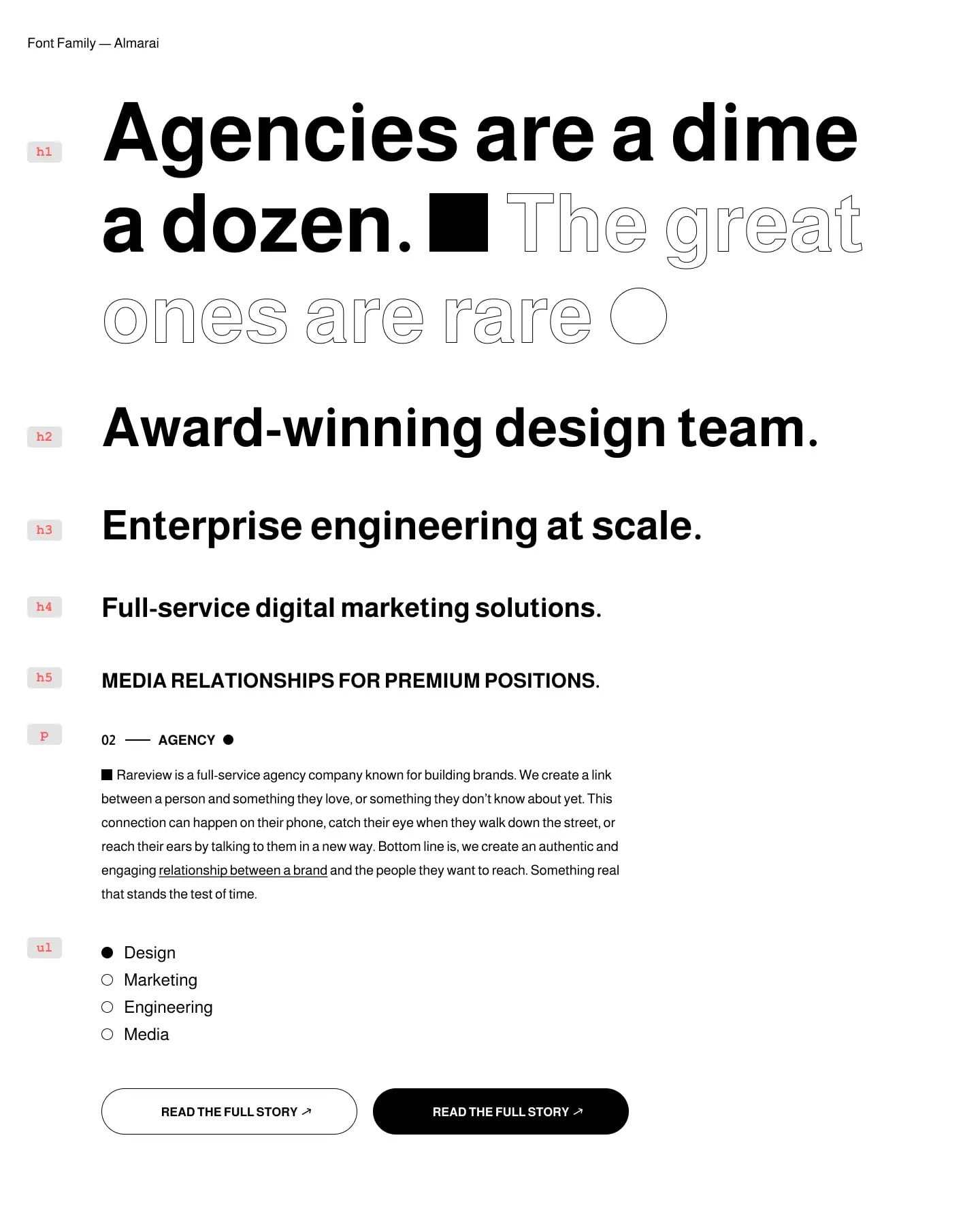
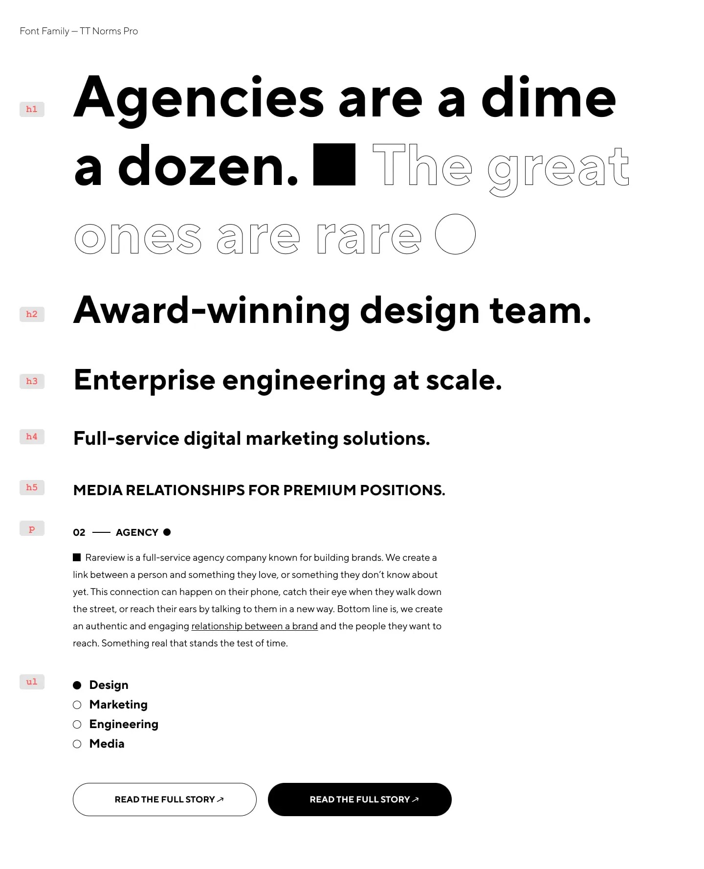
We explored several different fonts and looked for something that was modern yet classic, and also somewhat resembled the font we currently use. Here are some of our choices.
Font choice
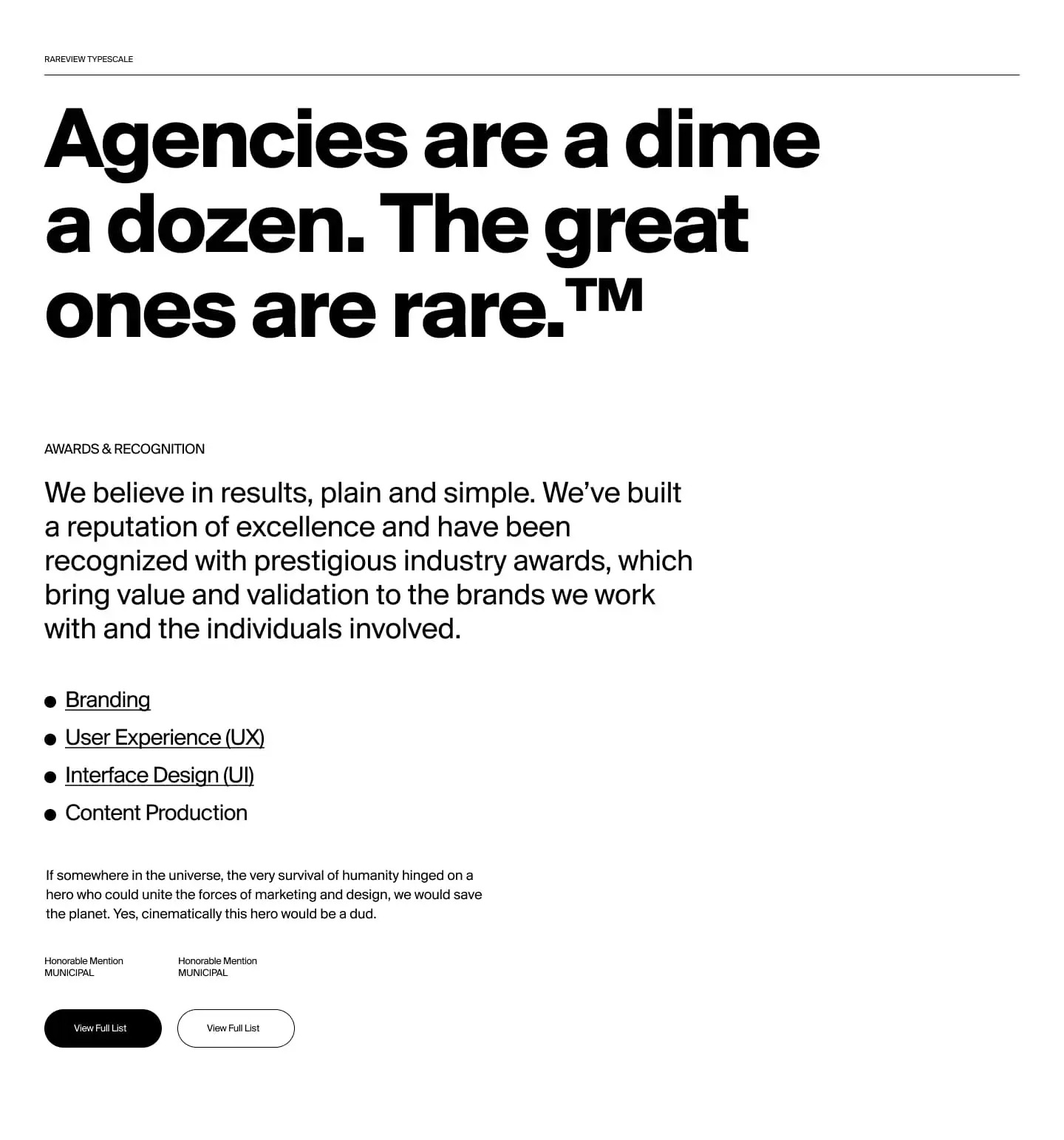
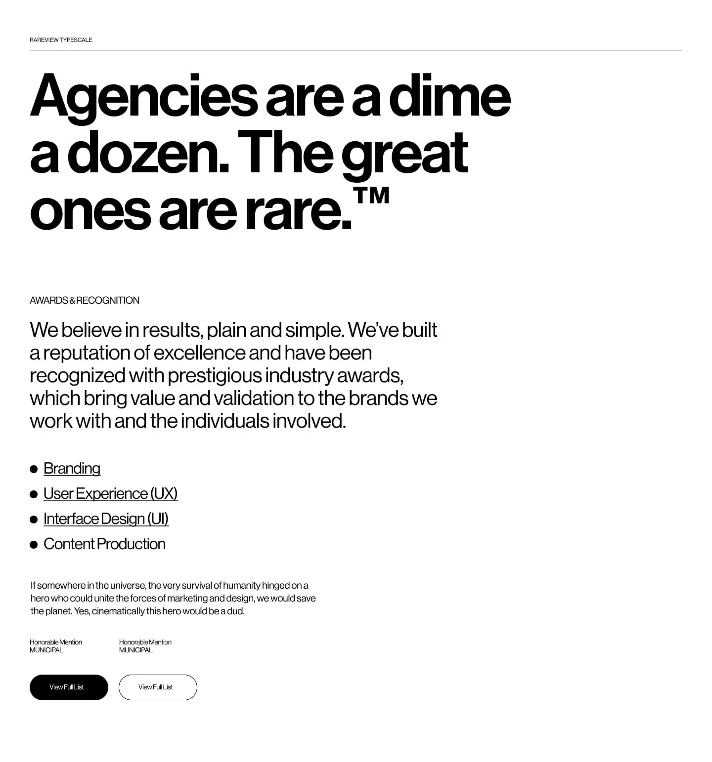
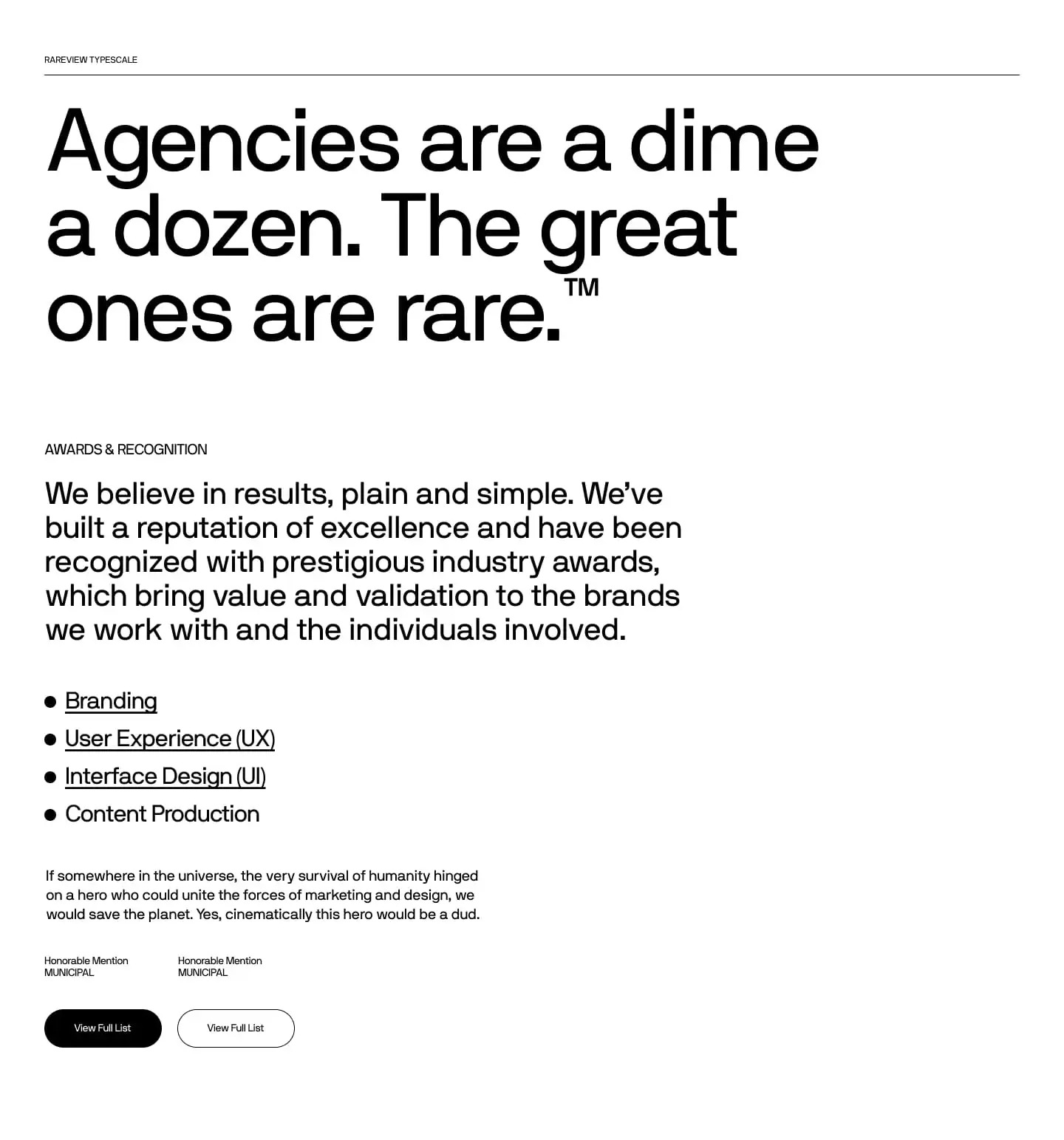
We have decided to move forward with Aeonik as our new font. It checks all the boxes for us.
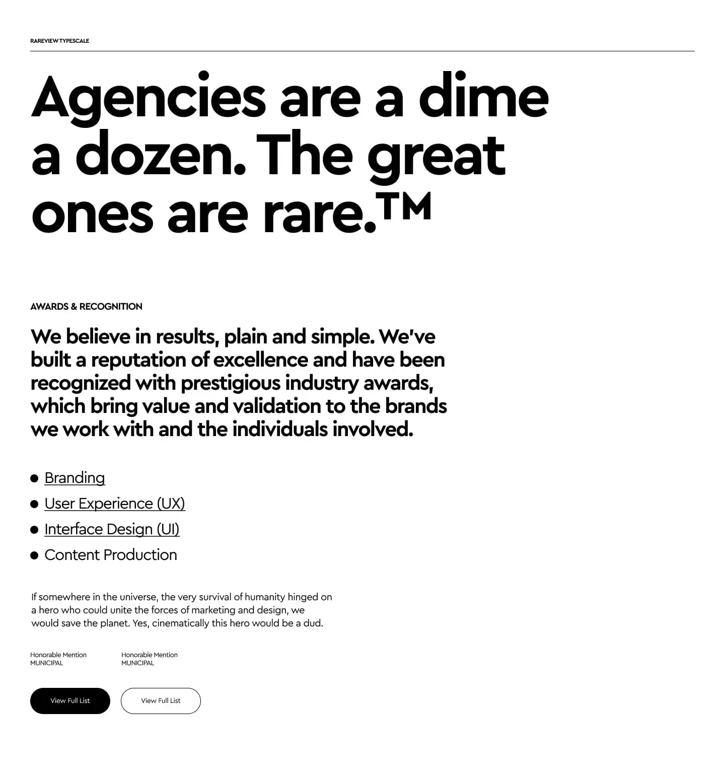
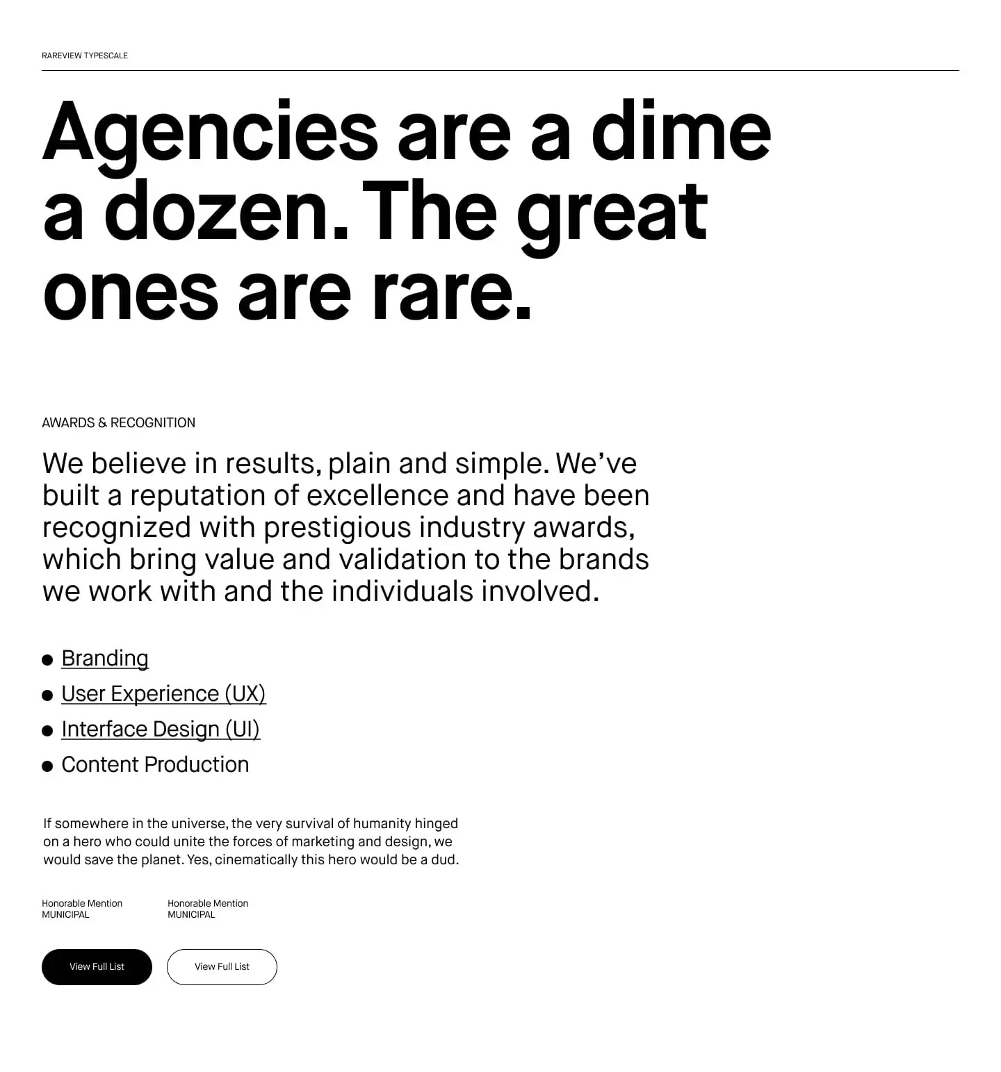
We are now deciding on how many weights to use. We were thinking of using (2), regular and bold, but after some discussion with our Engineers we are now leaning towards just using one weight (regular) for everything. It may be a small savings with performance, but anywhere we can shave milliseconds we will do it. Ultimately we want our site to be incredibly fast and that might mean some tradeoffs with less fonts, less animations, and less stuff loading.
Lean and mean.
Update — 22 October 2021
We are considering another font for photo captions on the site and blog. We’ll discuss with Engineering and we’ll still exploring this in design.