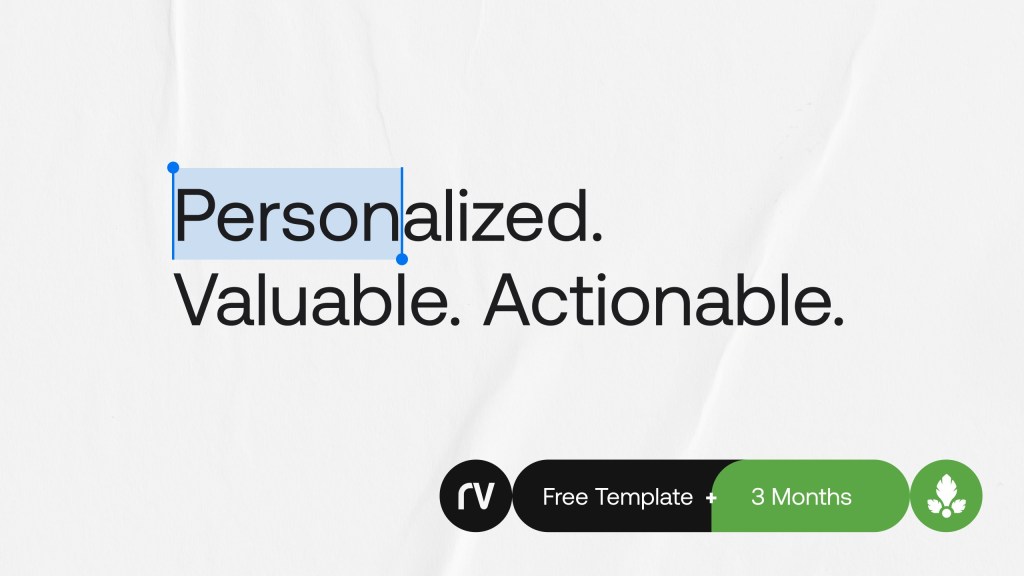
The written word is all around us, from the menus we glance at when ordering brunch to the myriad of overpriced canned beverages in the grocery – it influences almost every decision we make. We might grab that fuschia colored canned kombucha drink with a bold sans font over the basic, in-house brand because we are drawn to the inviting design. Plus, who wouldn’t want to hold a beautifully designed drink in our hands as you go about your day? While typography is more than beautiful fonts; it visually communicates a story, establishes content hierarchy, conveys your brand ethos, and influences our behaviors.
The origins of typography
From Clay Seals to Gutenberg’s Press
Typography is the art of arranging unique letters and text in a way that makes the copy legible, clear, and visually appealing to the reader with the goal of communicating hierarchy and a brand presence. The origins of typography span as early as ancient Mesopotamia where clay cylinder seals were engraved with financial transactions, official signatures, and even protection ‘devices’ (Source: Font Fabric).
Johannes Guttenberg’s invention of the printing press in 1440 became the turning point in how we define typography in the contemporary sense. The emergence of movable type, or the process of setting type by hand made for a printing on a letterpress, allowed for the composition of singly glyphs into longer lines of text. This style of printing ushered in the means of rapidly producing multiple copies of lengthy printed materials and books (Source: Font Fabric).
The anatomy of typeface
Form, figure, and function
A typeface is a collection of letters. Each letter is unique in its form and figure, certain shapes are shared across letters. The beauty in typography is the ability to understand how form and figure come together in establishing a brand’s identity and effectively conveying its message.
Material Design, a design language developed by Google in 2014, created a graphic that breaks down the anatomy of a typeface, which is a wonderful source for understanding the kits of parts in a typeface.
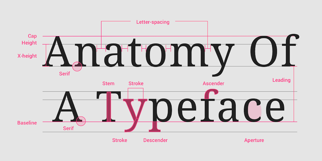
Names of letterform parts: aperture, ascender, baseline, cap height, descender, leading, letter-spacing, sans serif, serif, stem, stroke, x-height
When selecting a typeface, type classification is key in understanding how you want to communicate a message or emotionally connect with your audience. There are five main classifications of type.
- A serif is a small shape or projection that appears at the beginning or end of a stroke on a letter. You might use this in a zine or a fashion editorial spread to lean into that polished, sharp feel.
- A sans serif is a typeface without a serif, hence the French word sans that means without. Often a sans serif is used for a clean, modern project.
- A monospace typeface displays all characters with the same width. You may have seen a monospace type used in programming languages where it’s designed to mimic typewritten output.
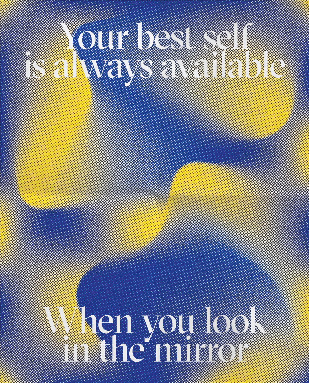
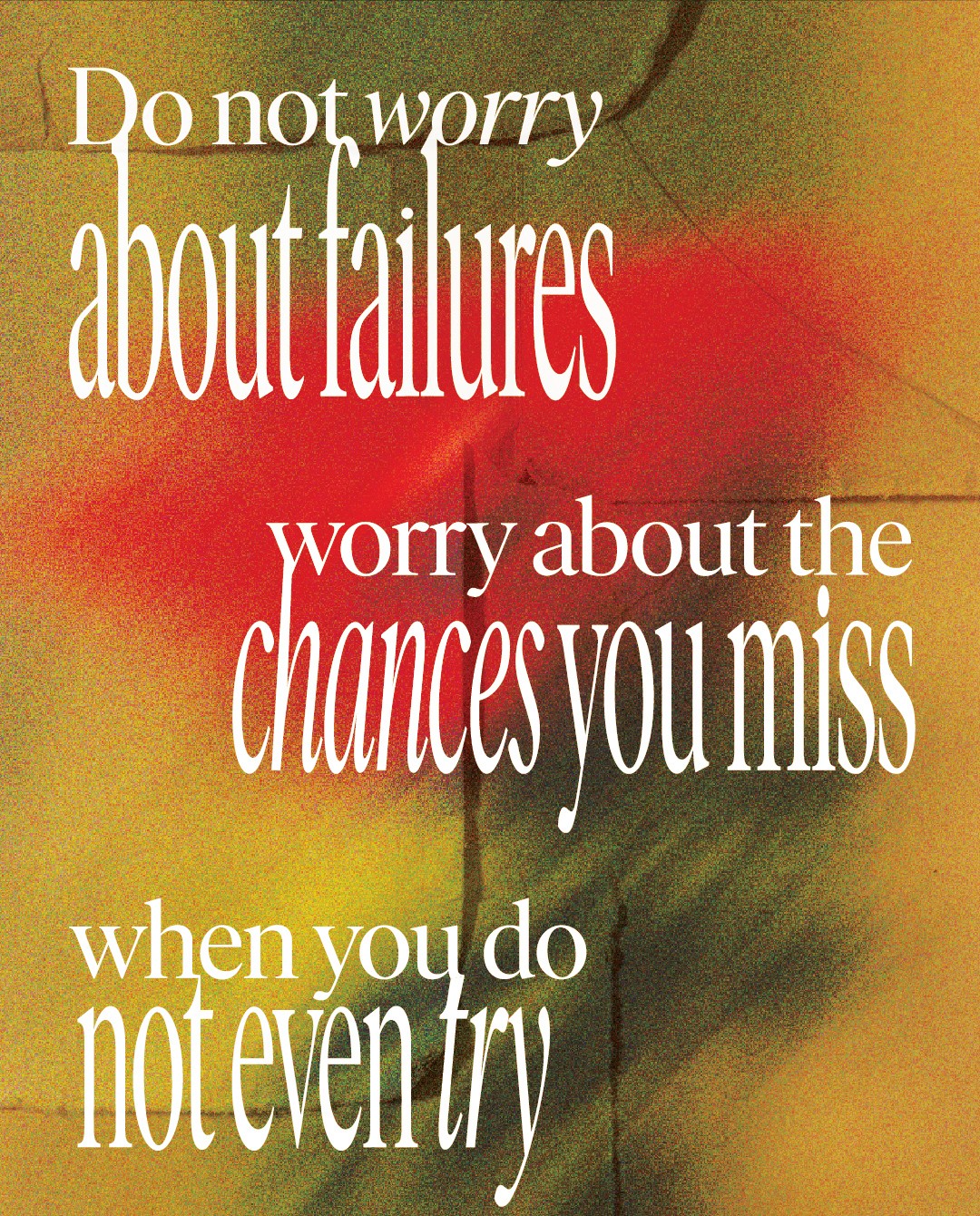
- A display typeface is ideal for large point sizes intended to purposefully grab the eye and emphasize key points.
A handwriting typeface are unconventional with a natural, handwritten feel that often is used to add a sense of whimsy and personalization.
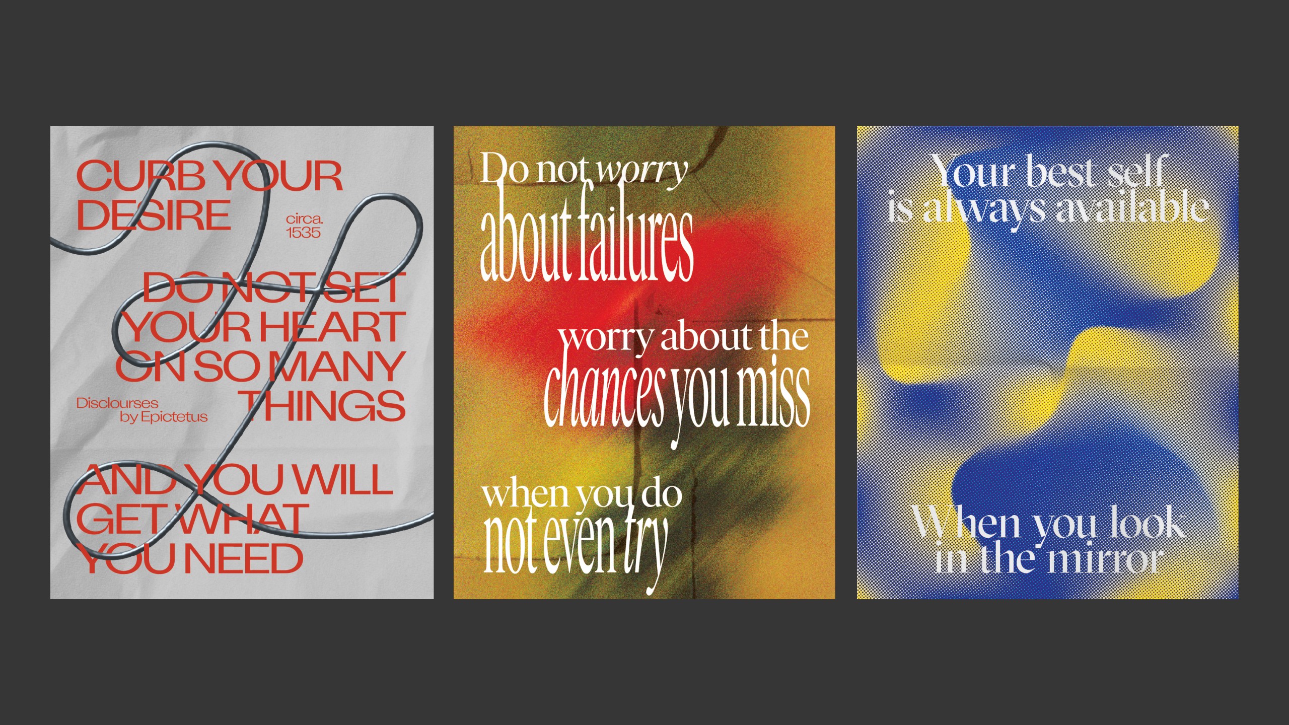
Our favorites
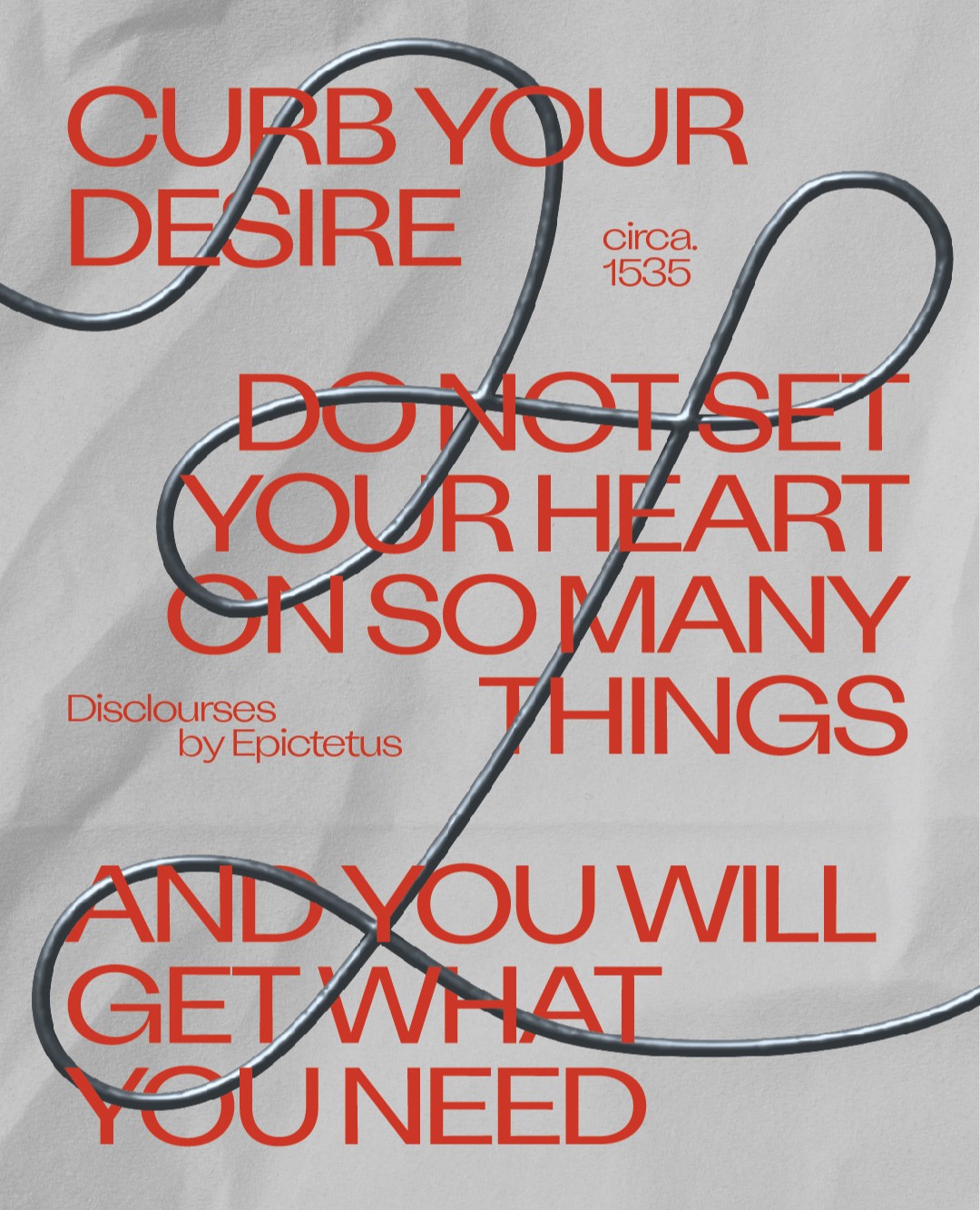
Here are a few typefaces that we’ve been loving – we also took them for a spin out in the wild.
Attila Sans from Kometa XYZ
Attila Sans is an elegant and meticulously drawn sans-serif typeface designed by Christian Jánský and published through Czech foundry KOMETA in 2019. It is noted for its curved figures and smooth lines, standing proud and wide, exuding a confidence that reads beautifully across its font weights.
Sectra from Grilli Type
GT Sectra, is a contemporary serif typeface designed by Dominik Huber, Marc Kappeler, and Noël Leu for Grilli Type in 2013. Merging the sharpness of a knife with the calligraphy of a rib pen, the font was originally designed for the long-form magazine ‘Reportagen”, a publication housing interesting stories from all around the world.
Ivar Display from Letters from Sweden
Ivan Display, is a serif typeface family designed by Göran Söderström and published through Letters from Sweden in 2017. The typeface stands on the shoulders of giants: the design refers to the dependable text faces from the mid-1900s, which in turn were rooted in classic designs from the 16th and 17th century. Ivar comes in three optical sizes, with names – Text, Headline, and Display, detonated to suggest how they should be applied.
As we navigate the world around us, the importance of typography is not merely for aesthetics, but the importance of how a brand decides to show up in our everyday lives. It influences our choices daily. It holds the power to make a mark in this world. It makes us imagine what is possible. Now, that’s the power and beauty of design.